Luminary
This project revolves around a conceptual jewellery brand, Luminary. It aims to refresh and imagine a new brand identity for an up and coming jewellery store with the core values of elegance and individuality. An online presence was created to elevate Luminary in modern day.

Brand Identity
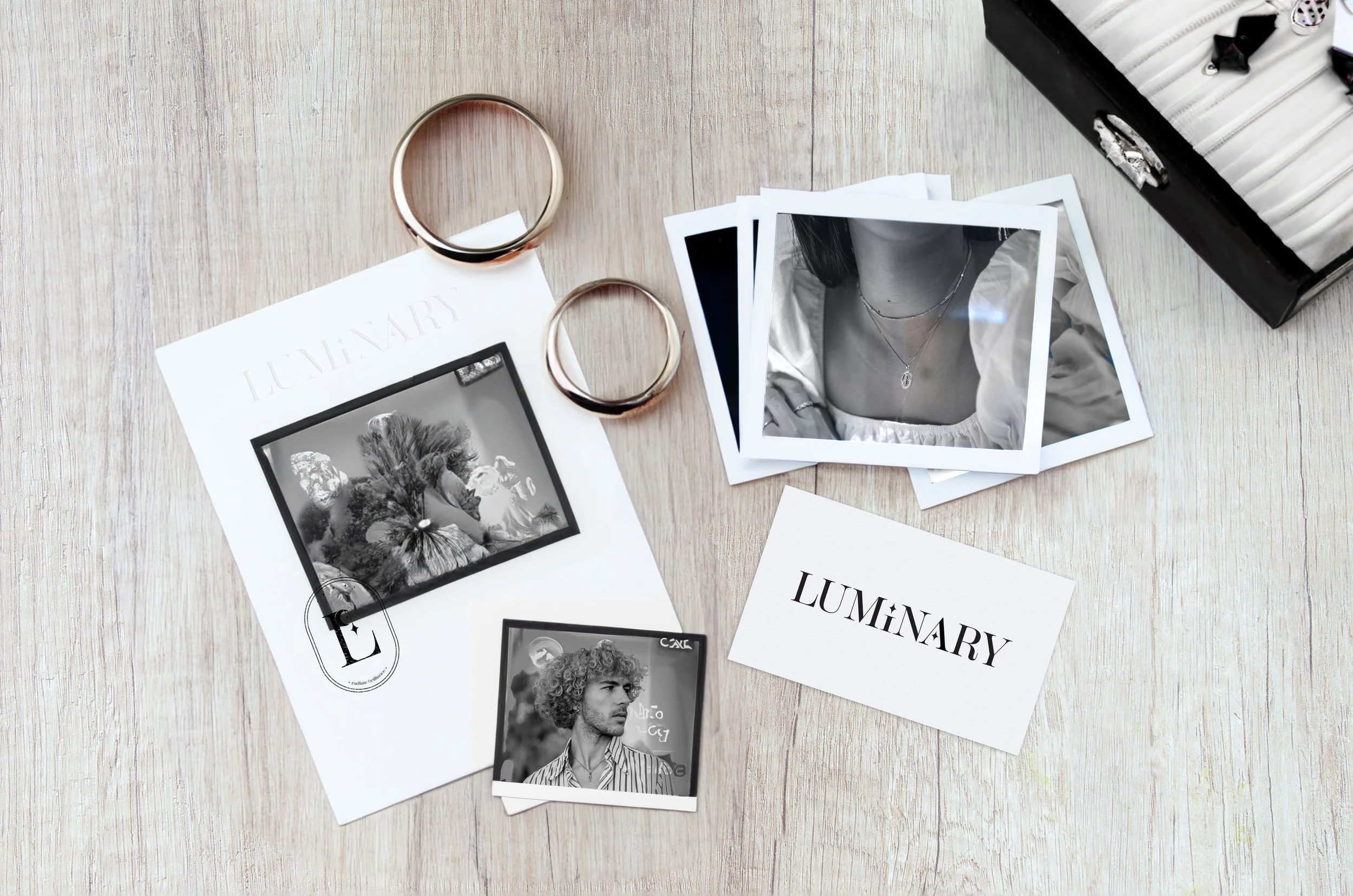
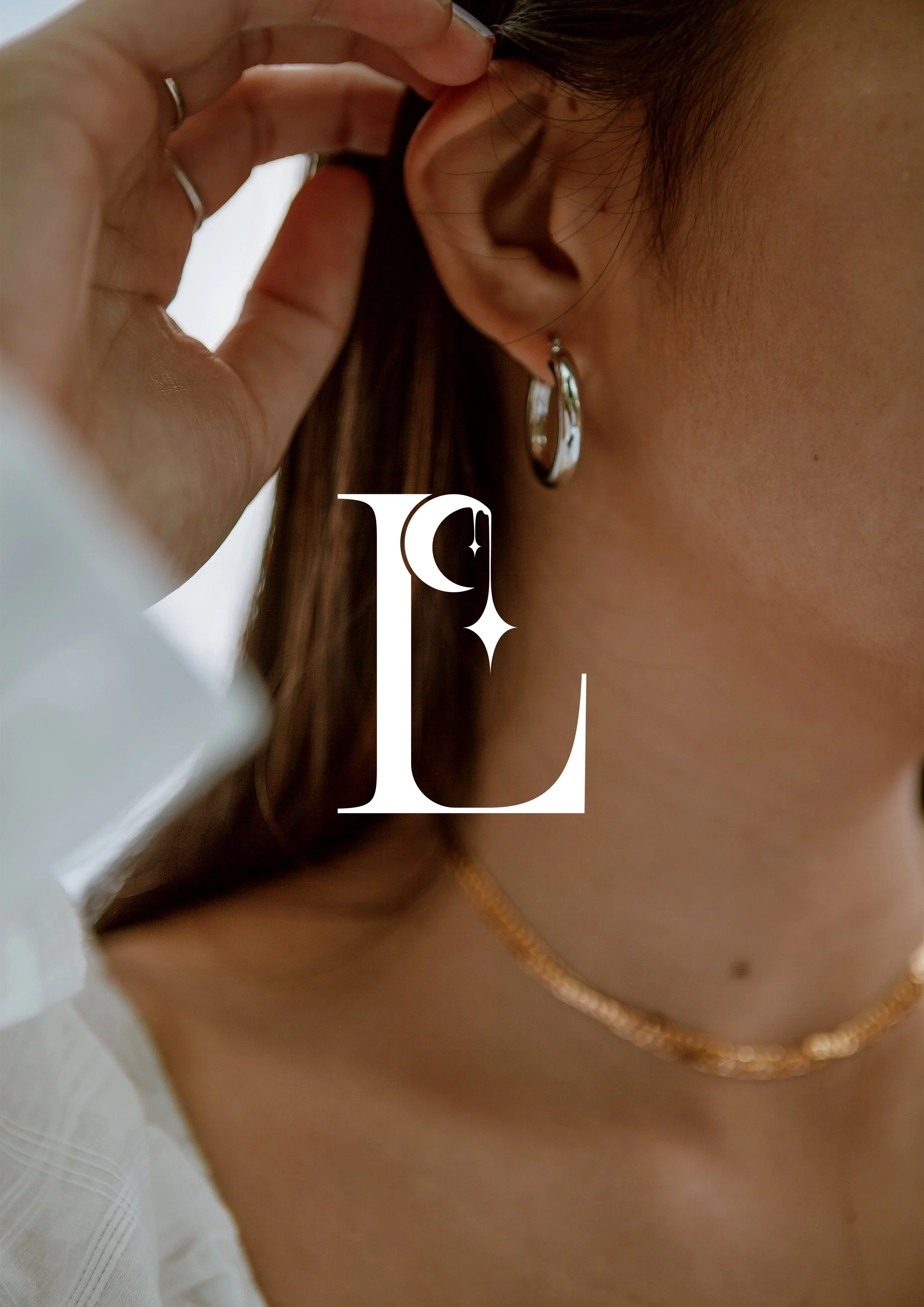
The logo of Luminary had to be kept minimalistic. A serif font was chosen over a sans serif to glorify the elegance this brand holds. Stars were also created to add a simple touch of customisation, making the brand its own. These stars then become an icon for Luminary to use throughout the brand. Black and white is also and intentional feature, so the brand continues to look more high-end and to not distract from the intentions of the brand.
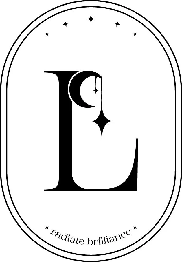
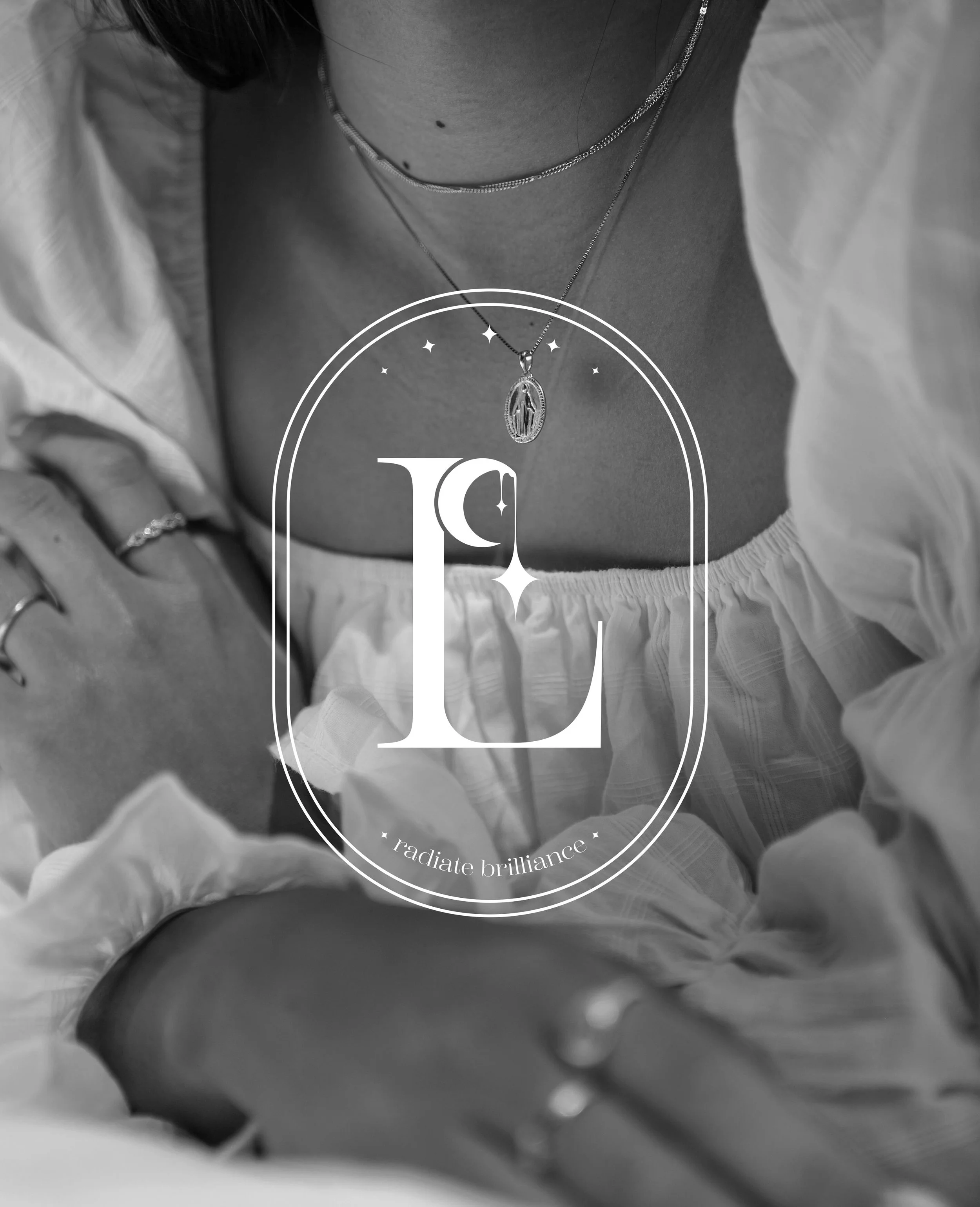
Whilst having the standard logo is usable on its own, a stamp-like logo was created to give more personality. This logo utilises the company phrase “radiate brilliance”. By featuring a moon and stars, this variation also helps to bring the brand identity back to its roots of timelessness and individuality.
Website
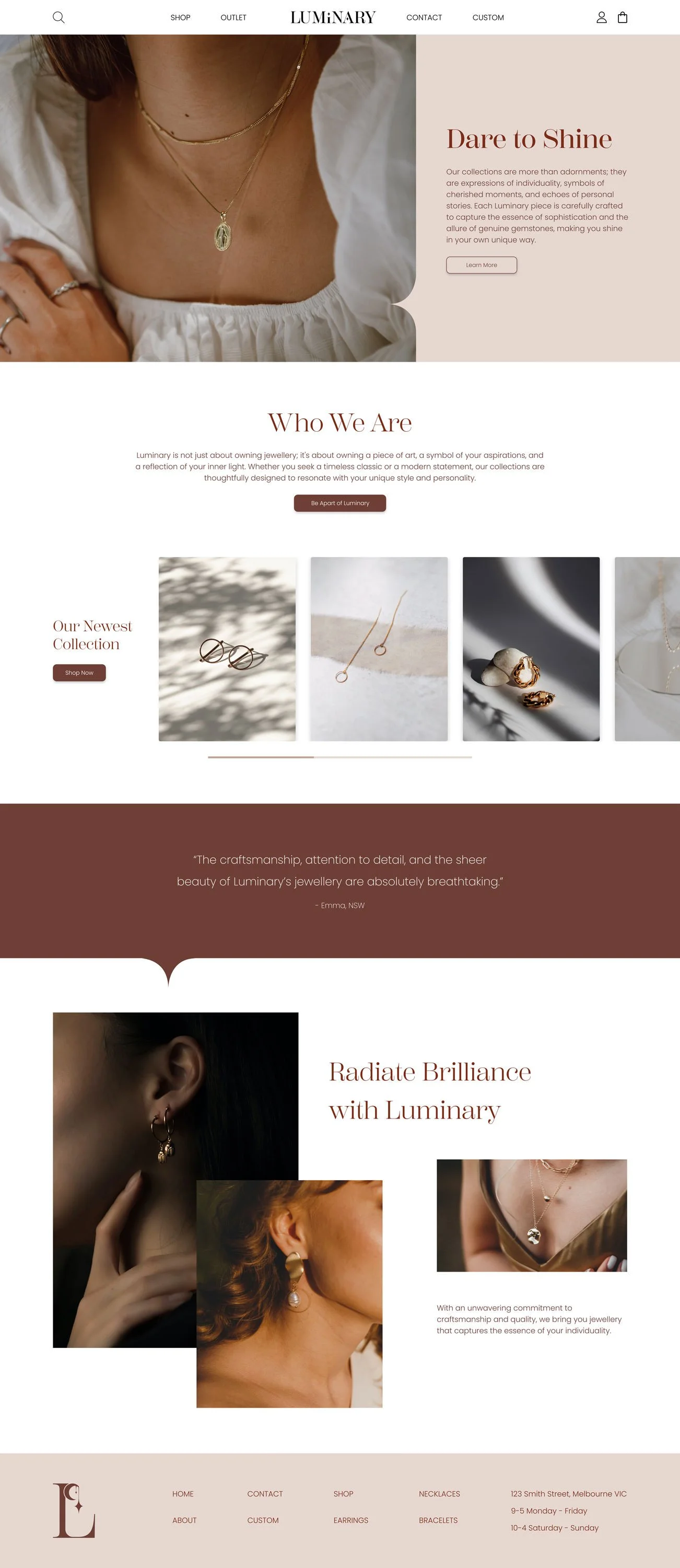
A simple, straightforward website was designed to showcase the products through natural imagery. This home page provides information about the brand, features the latest selection of products which the company would be able to change themselves, ensuring the website is kept fresh, up-to-date and continually promoting their products.
The star icon has been used on block colour sections to connect an image, or other sections to each other. This aids the flow of the website and keep the individuality of the company.
This simple approach to the website design, allows the website to have a solid foundation to stay approachable.
