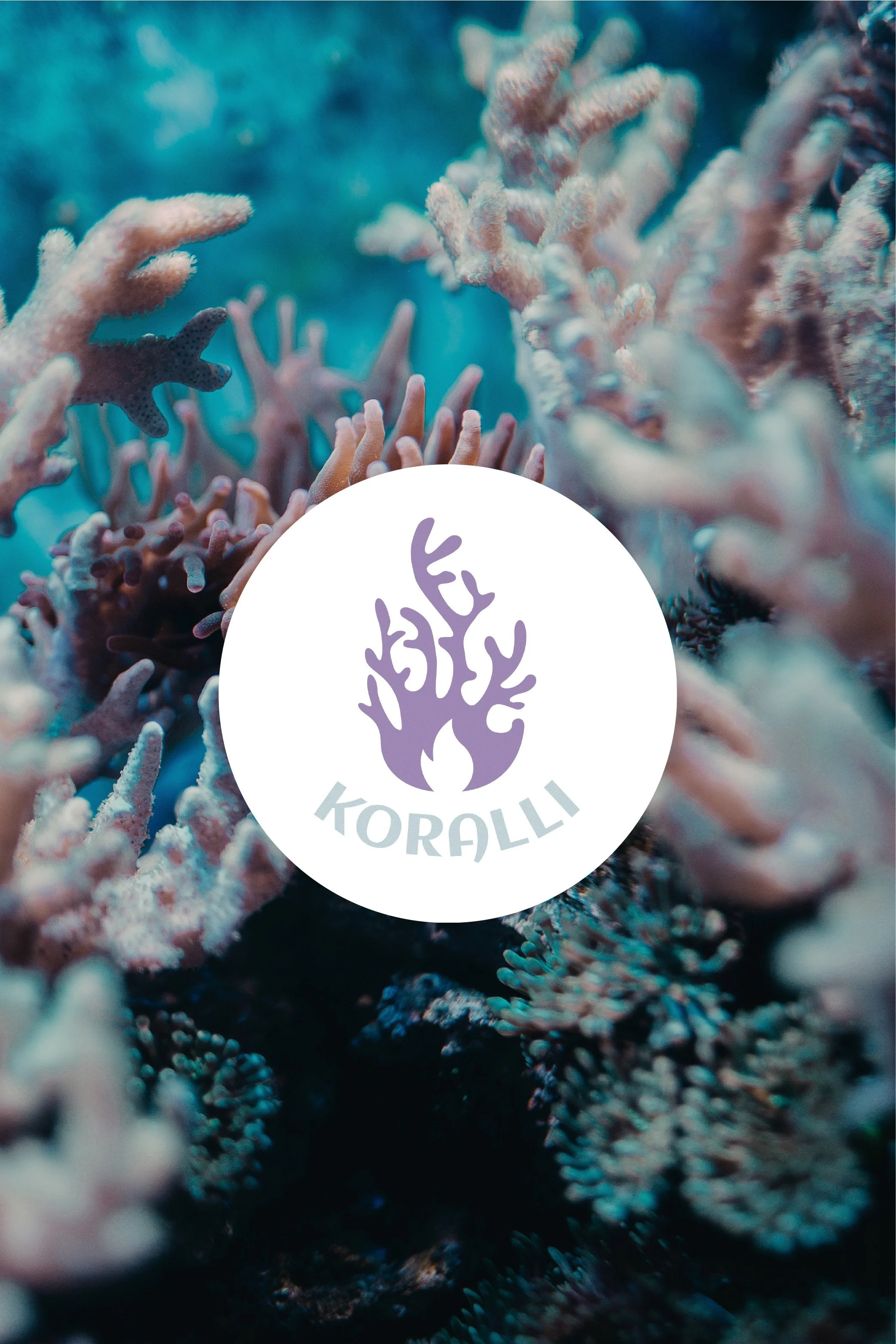
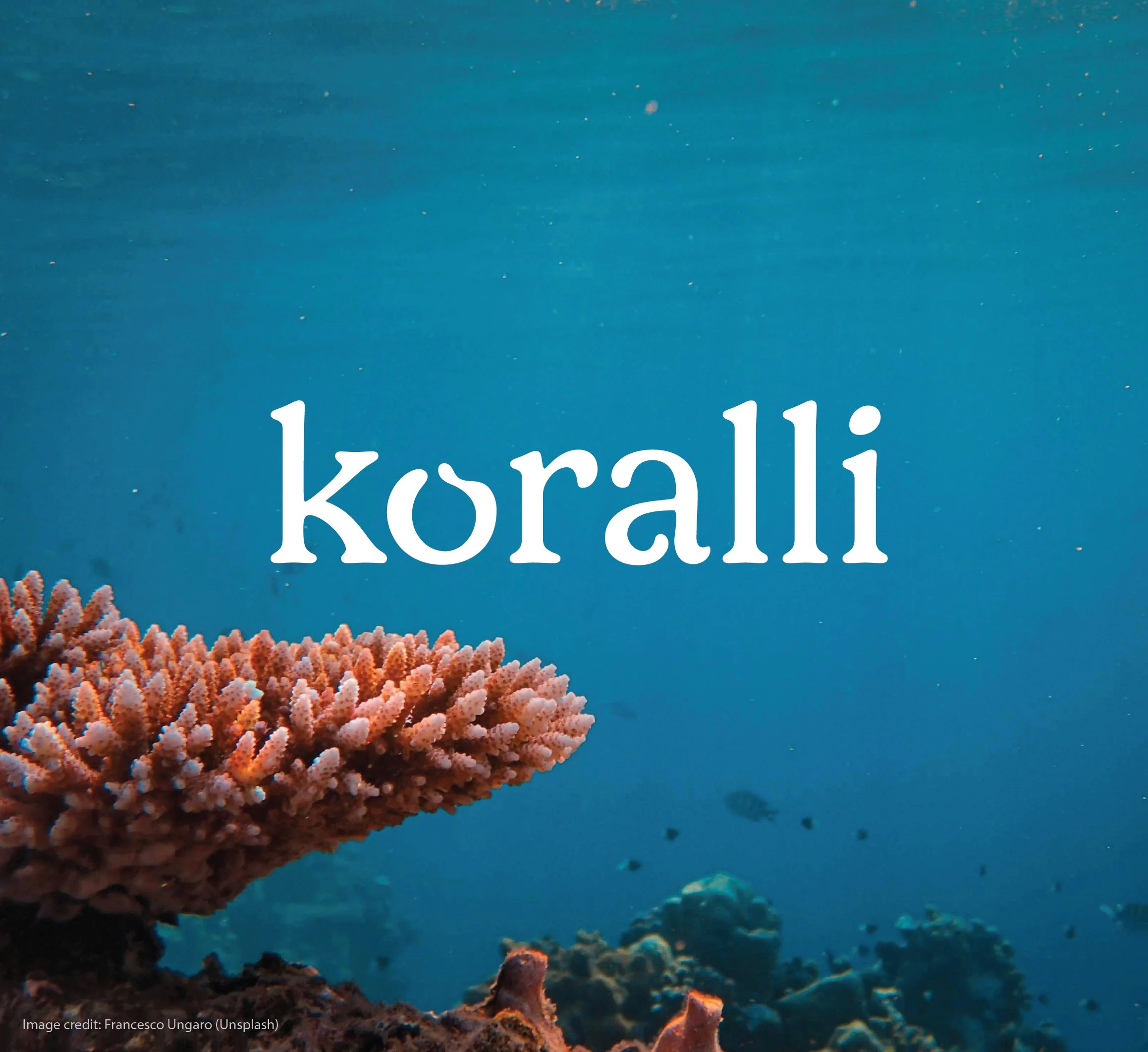
Koralli
Koralli, the origin word for ‘coral’, is a brand that aims to bring attention to the environmental issue of coral bleaching. Initially designed in 2021, Koralli is a new business, who wants to reflect their objective in their logo and graphic, whilst attracting the Melbourne demographic by styling themselves in a contemporary street fashion sense.
A refresh of the brand was created in 2025, steering away from a street fashion sense to a refined idea coming soon.
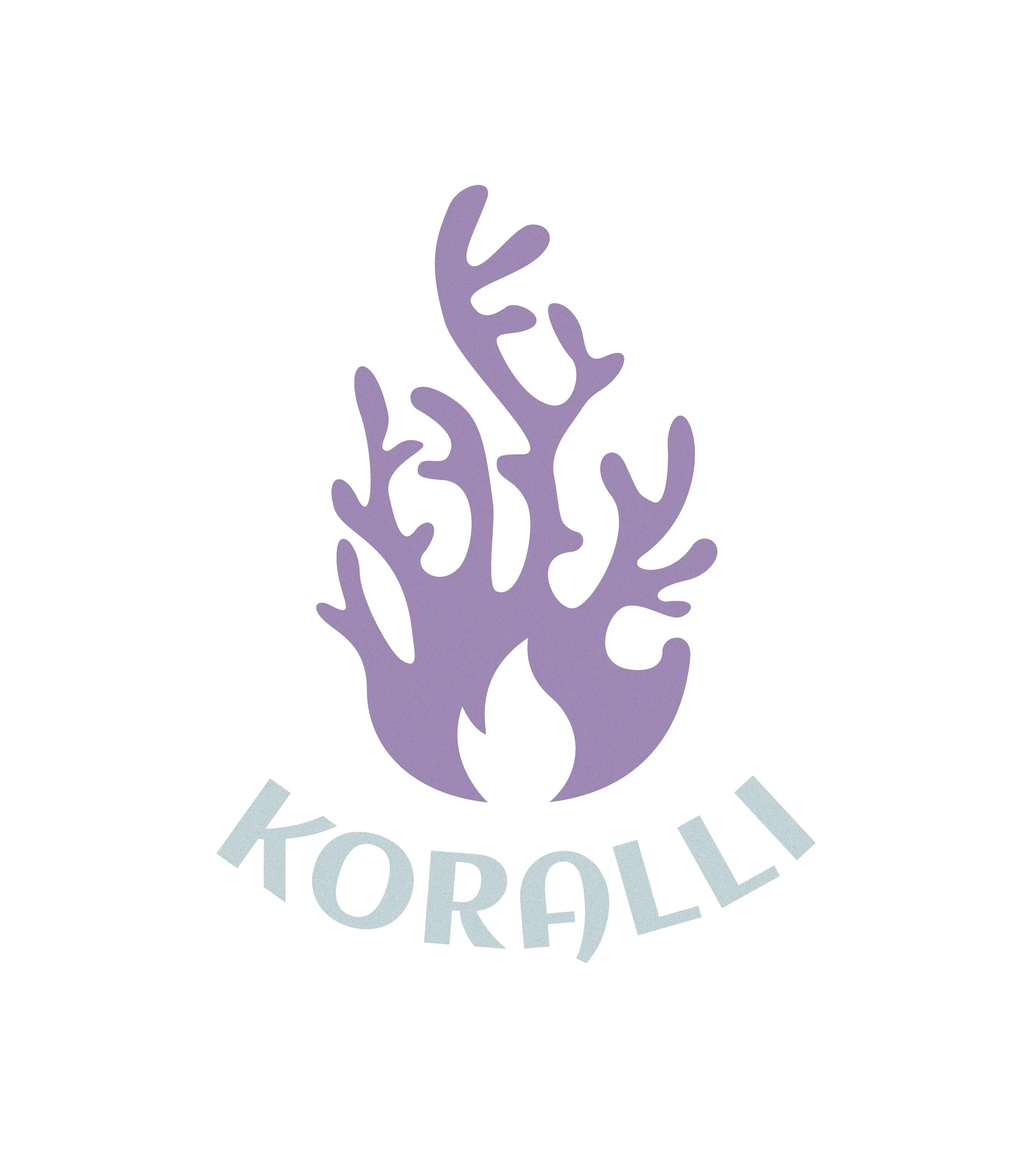
2021 Initial Concept
Each element in this logo was thought through thoroughly. The coral icon is shaped as a flame, with the branches helping to guide the shape. This demonstrates the rising temperatures of the ocean, which is the cause of coral bleaching. A cool colour tone was to keep with the ocean theme.
The use of purple was used due to the colour initially being created from the crushing of sea snail shells, where the purple mucus was extracted and exposed to the sun. This aligns to the ocean values and theme of the company.
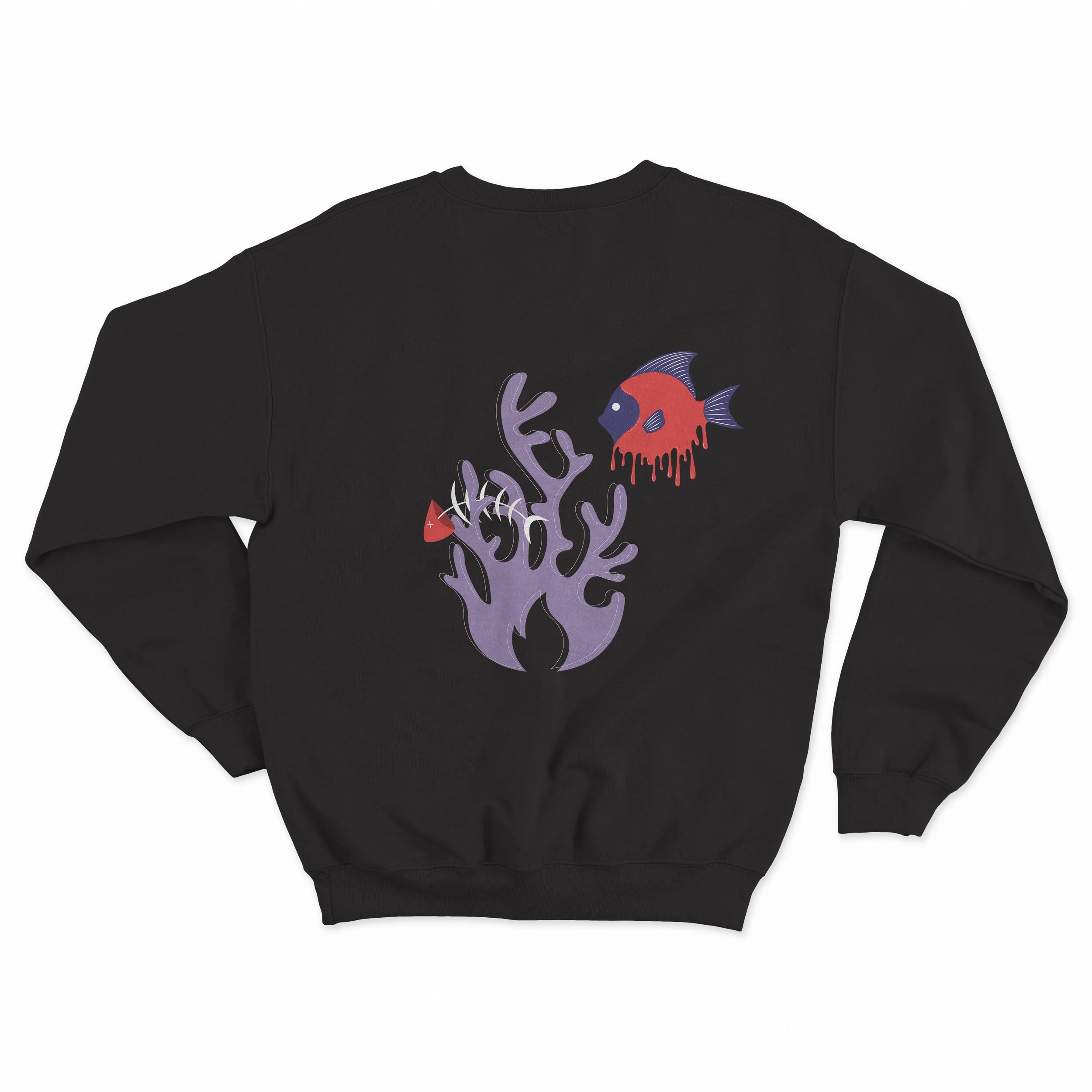
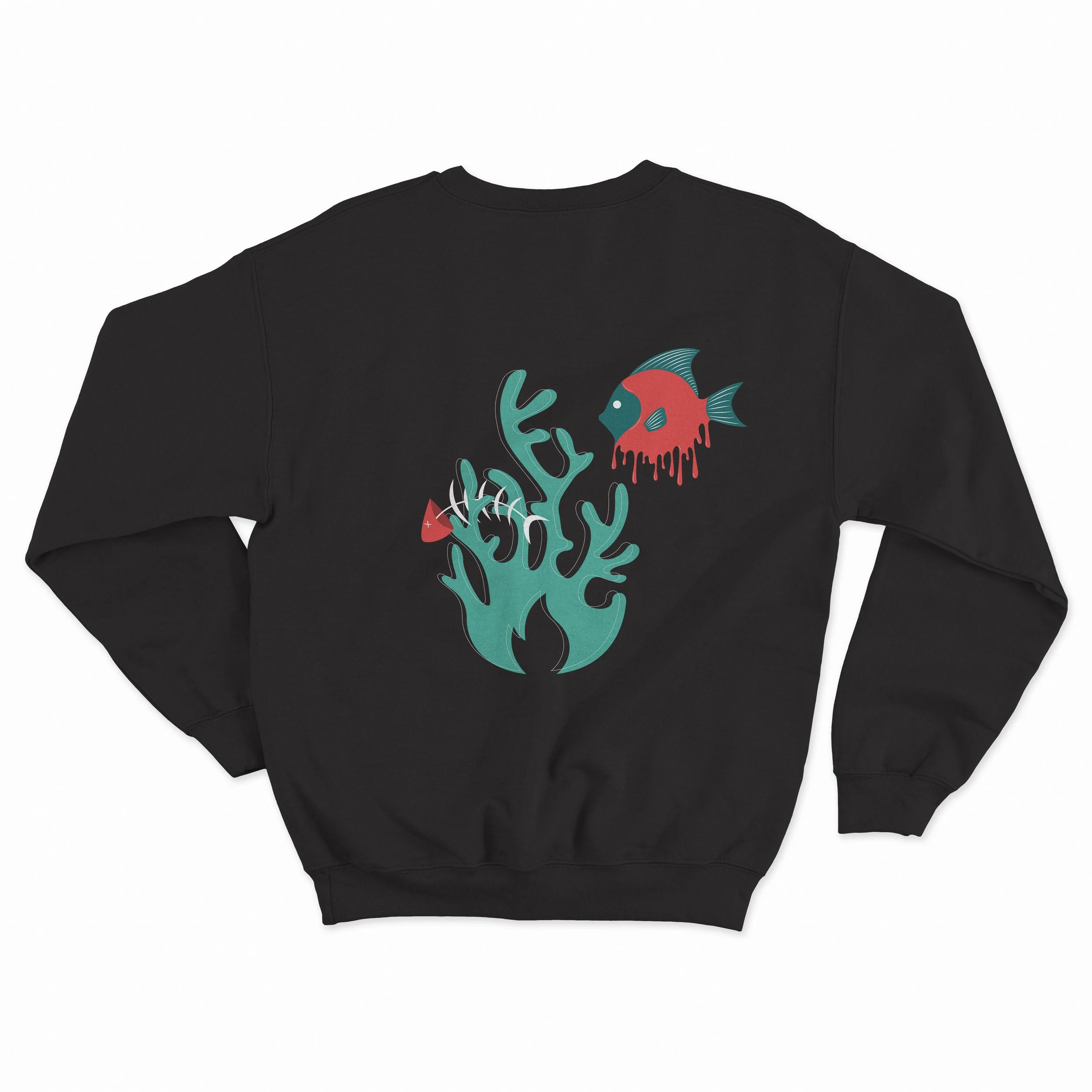
2021 Apparel Design
The final jumper design for Koralli is presented with two different colour schemes to attract different consumers. Both designs feature a ghost fish swimming through the burning coral. A skeleton is also added to bring the design together, but to also represent the final stage of the fish’s life. You can also see there is a coral outline over the top of the solid coral. This helps to represent the coral skeleton and is white to represent the colour of coral once bleached.
This fish design represents the fish dying because of the coral bleaching, and their habitat being lost. Ghost-like eyes were used in the final design to push the feeling of death, combined with the bright red colour.
Printed big on the back of the jumper helps to adhere to the street like fashion. Green as the alternative colour to purple is also used for the contemporary sense.
2025 Identity Refresh
As brands evolve over time, it’s important to refresh the brand identity, ensuring brand relevance.
Koralli’s logo has been revamped in the recent year to be more modern and simple, straying away from the boldness and complexity of the previous logo. With the same brand aim and motivation, the new logo keeps the purple colour as it hold meaning, but adds sleekness to be more enticing to the current consumer market.