Frosty Cocktails
Frosty Cocktails is a conceptual brand where frozen delights meet adult indulgence. This modern brand identity, blends the playfulness and colourfulness of ice cream, with the confidence of adulthood and a twist of vintage charm. This project invites you to have a taste of its contemporary logo and a more playful icon.
Brand Identity
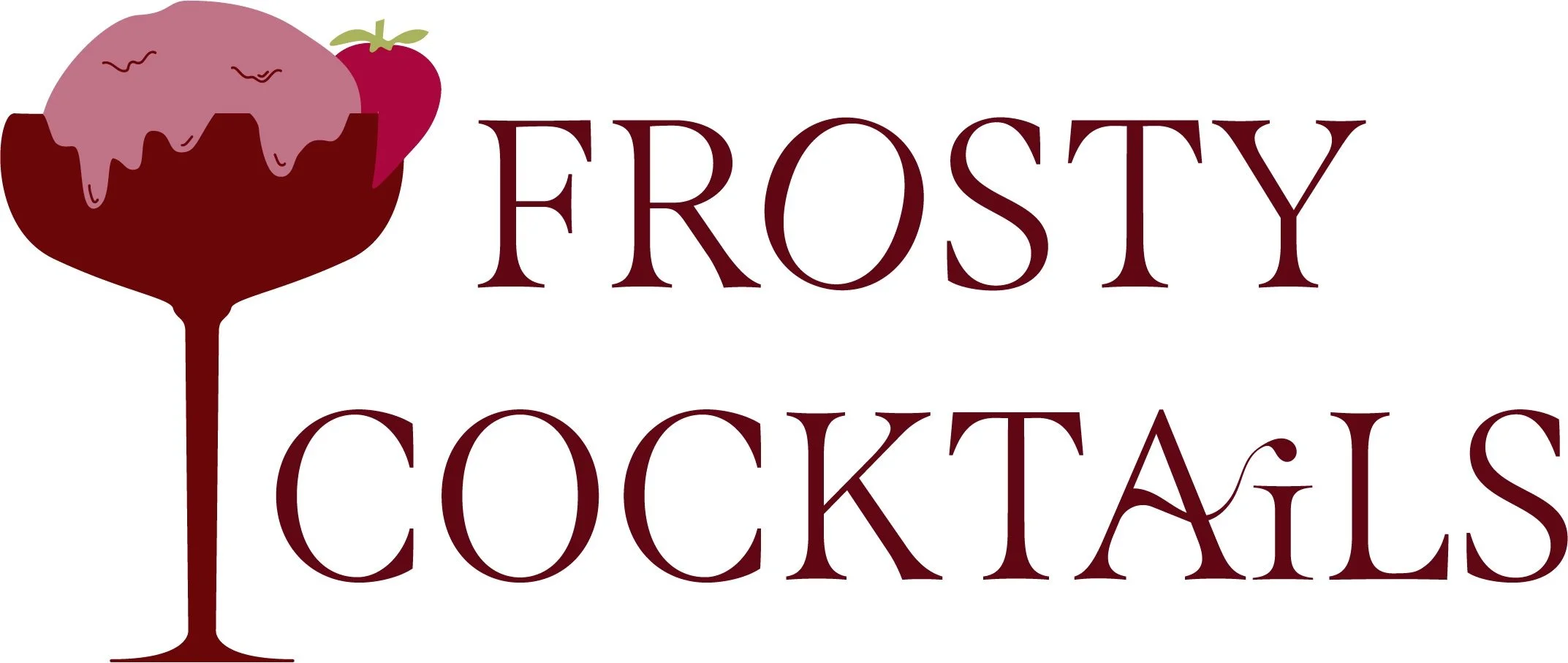
The key logo of Frosty Cocktails provides the base of the style for this company. The font choice, combined with the customised flare with the ‘O’ and ‘A’, shows the maturity of the business, whilst still acknowledging the unwinding joy of ice-cream. This attracts the correct target audience to admire and purchase the product.
The icon makes use of the silhouette of a known cocktail glass combined with a more detailed ice-cream scoop to represent the brand. Continuing the sharp lines and softness of the curve touches in the font, the icon is able to convey the correct concept of the brand.
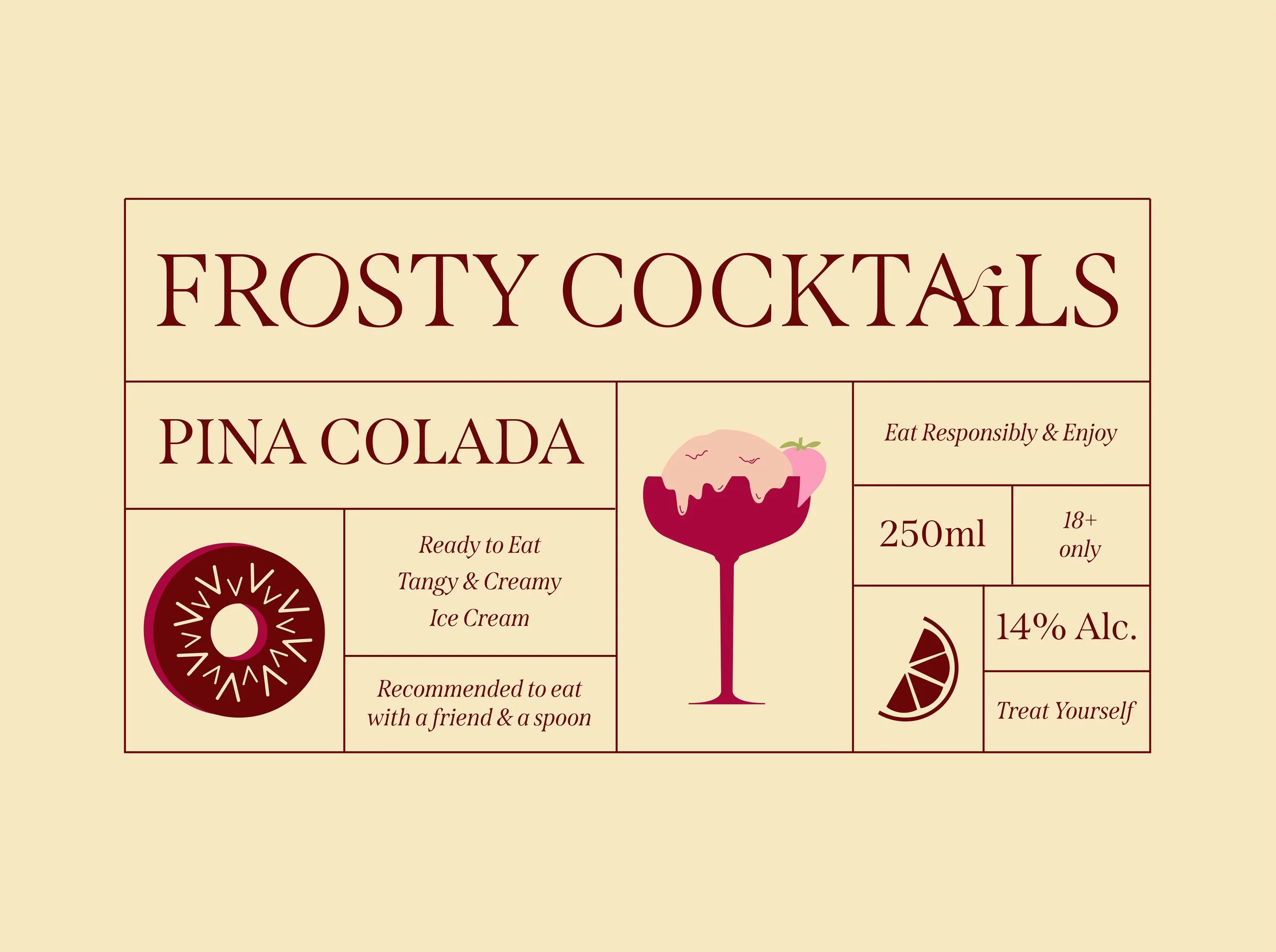
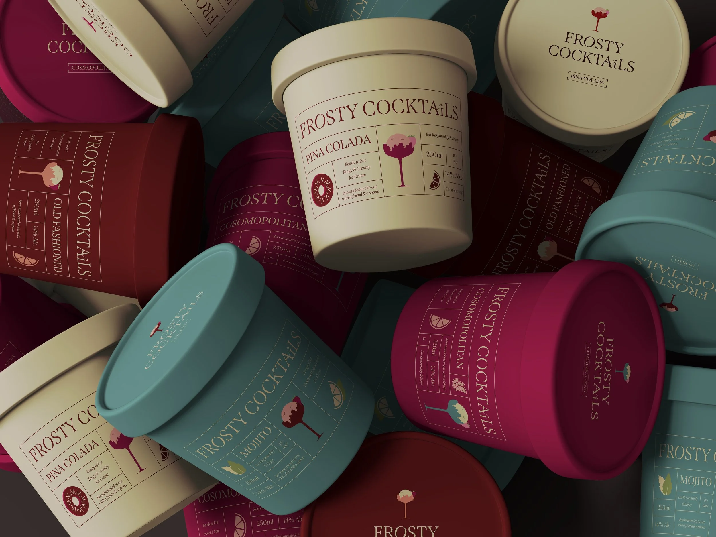
Packaging
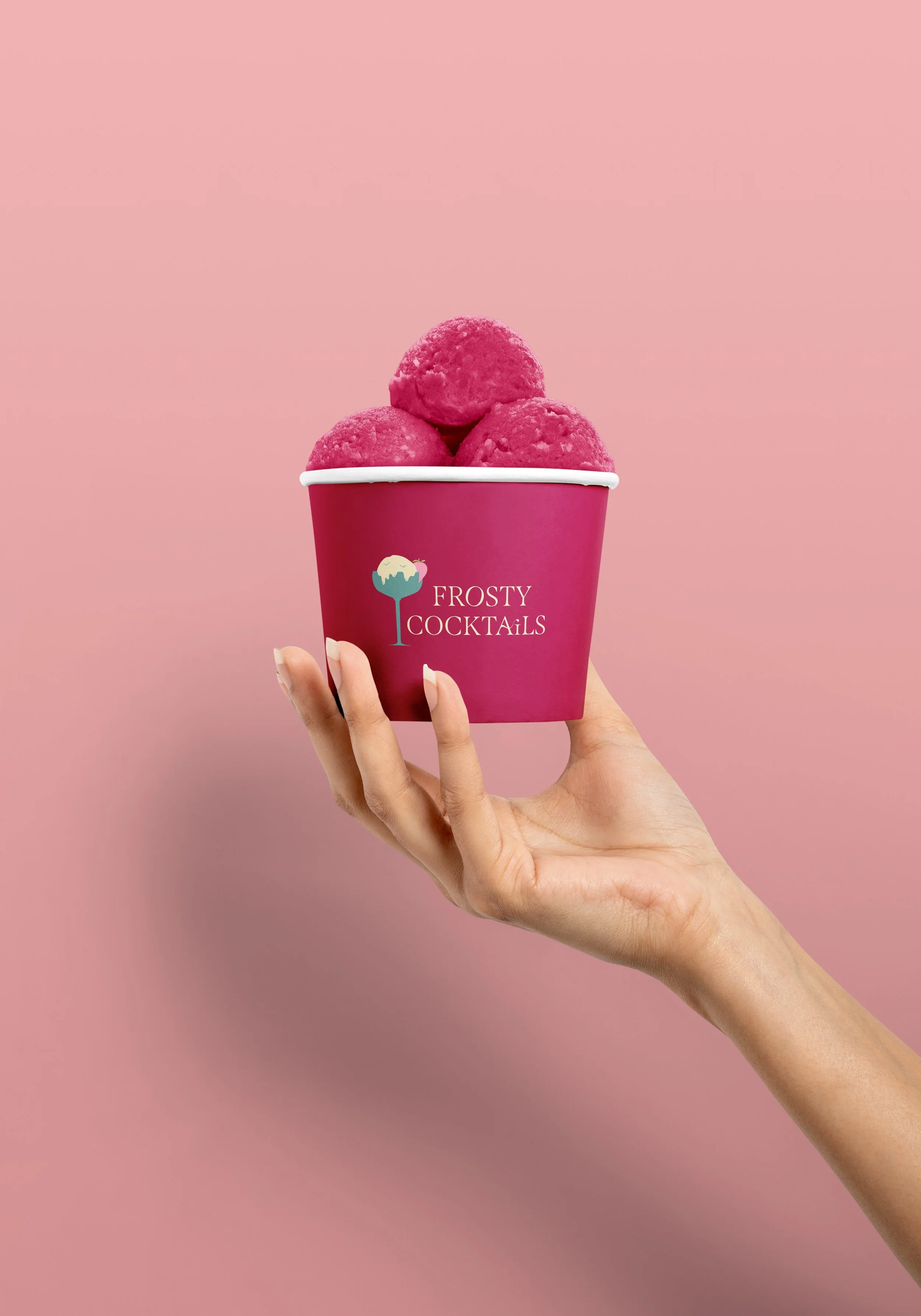
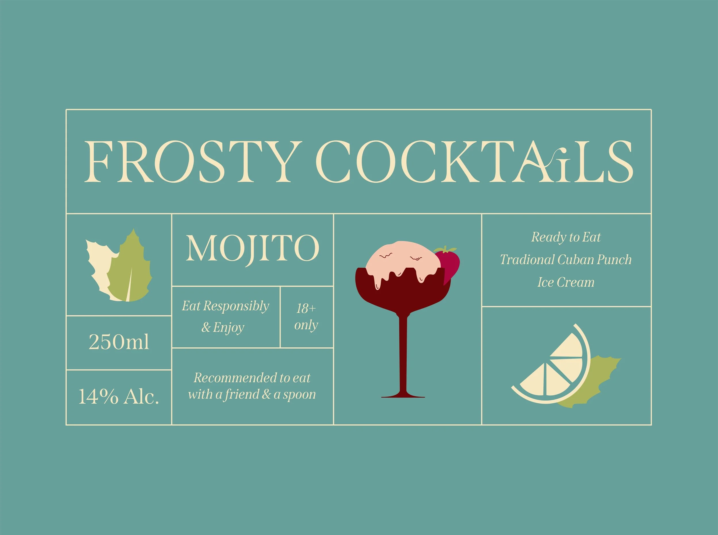
In pairing to the logo, these are two packaging design examples for the ice-cream containers. Each label would adhere to the vintage style, utilising the sections for different details. Important information would be included on all designs with the flavour clearly labeled. Different variations of colours would be used depending on the flavour, so that regular consumers can easily identify which flavour they were after without having to read. These colours would also match with the well known cocktails so that consumers can subconsciously pair the flavour with said colour.
Icons would also be used to aid in the representation of the cocktail, these would appear in similar style to the cocktail glass, ensuring consistency throughout the brand.