Silent but Loud
Created in 2021, this university project involved responding to a brief that required two different magazine layouts to be produced to match two music publications; Limelight magazine and the Wire Magazine.
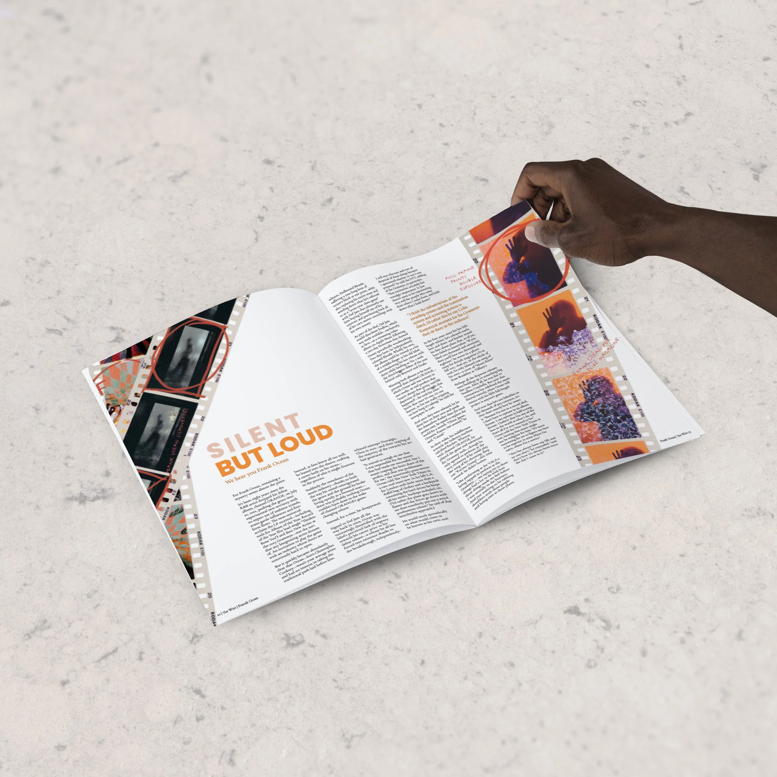
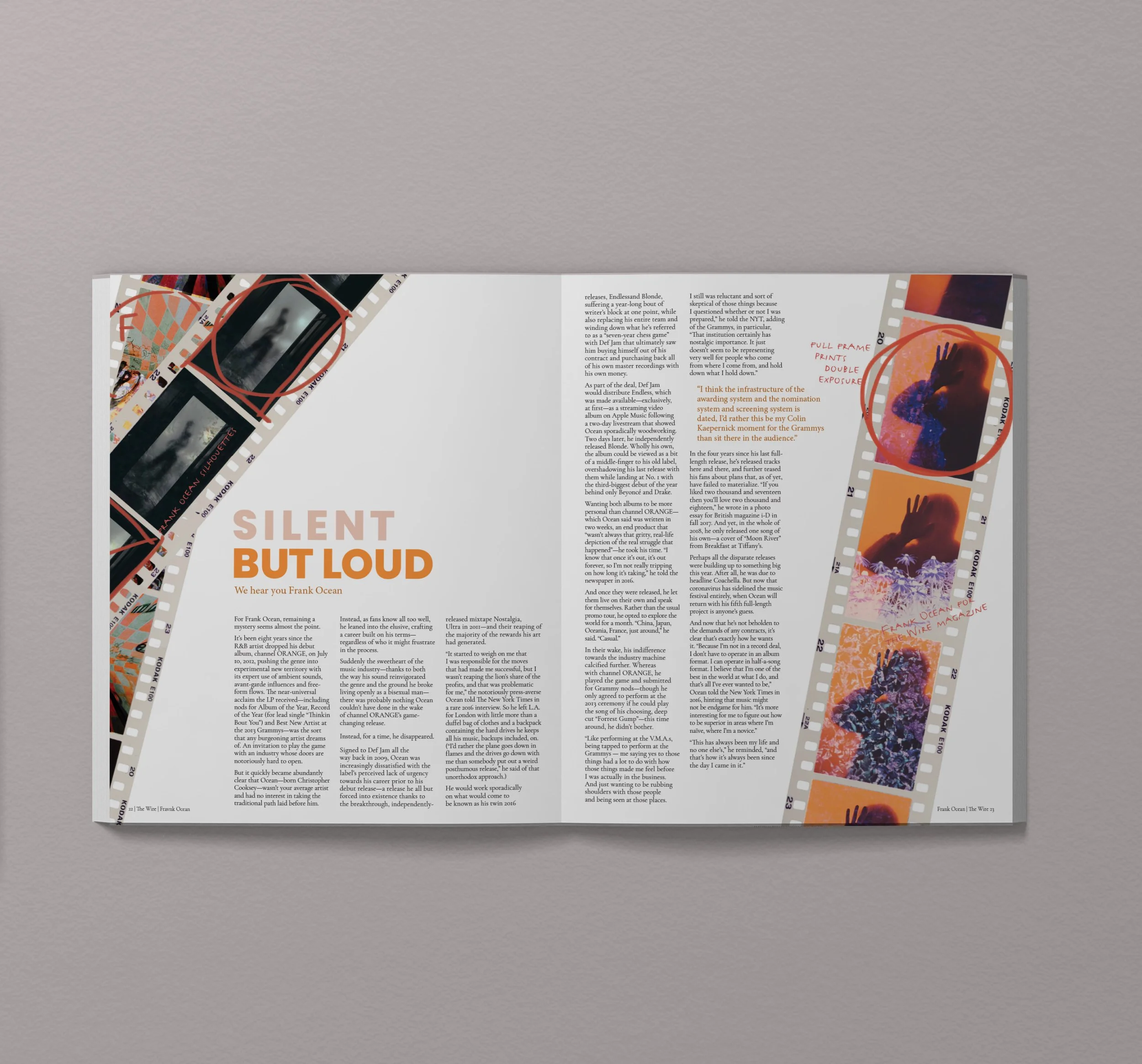
Layout One
The Wire magazine is a playful publication. This design adopts a tabletop view where film negatives are placed on both sides of the double page spread to balance the design. These negatives are placed in a way that it seems as though the viewer is looking straight down on a light box. Handwritten text has also been added to mimic the way a real contact sheet which people will generally write on.
The orange tones used in this piece also mimic that of a film negative, generally these are a lot darker, but for the sake of the design, they appear brighter as if a light is being shone behind it.
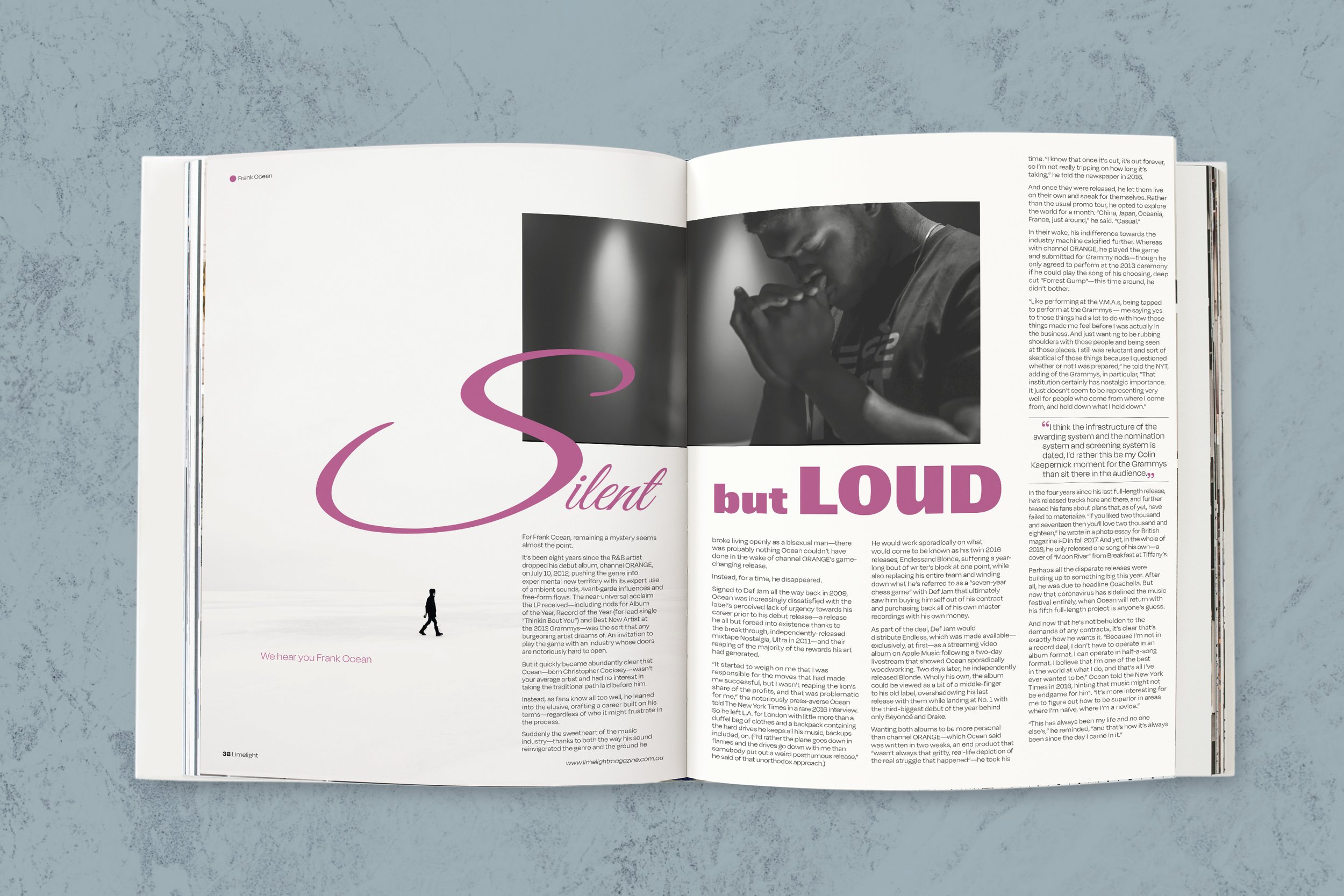
Layout Two
Limelight magazine is more formal in their layouts, playing around with contrasting typefaces in their headings and generally using one colour throughout their designs. My design incorporates these elements and uses images that reflect the contrasting heading, but also align with the style of Frank Ocean and the topic of the article.
This design aims to reflect the feeling and mood of what the article is actually about. This heading “Silent but Loud”, uses two very contrasting words and feelings. To showcase this, contrasting typefaces were used, as well as different font weights. To keep this design interesting, the letter “S” in the word “Silent” is bigger and comes in from the left. It uses its big curves to provide a dynamic sense against the otherwise very static design.